10 Best Animation Websites
When I looked at sites that use animation, I was really sifting through to find designs that had an impact, told a story, and had a purpose for the animation. My question being: does animation make your website better?
For the most part I found sites that had a lot of heavy duty animation, some better then others; few and far between were sites that had animation that really worked at adding value to the purpose and experience to me, the user.
I looked at these sites on my laptop and then again on my mobile phone.
Comparing the use of animation on both devices, the impact for each site on each device varied; some web designs using animation when viewing from a mobile phone had the same impact, others a better impact when viewed by phone, and then there were sites that almost or altogether had no animation when viewed by mobile phone (or if they did have animation, it lost its impact).
Here are my top ten rated animation sites, number one being my favourite and ten still being good, slightly less favoured for reasons discussed below:
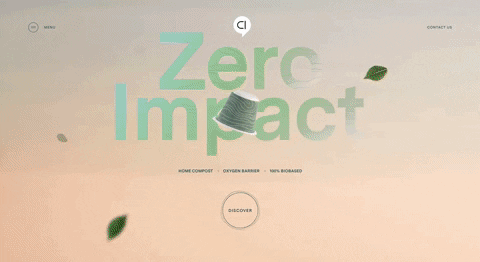
1. Capsul-in-pro
Capsul-in-pro takes the number one spot, this site utilised the animation to showcase the product, (an eco friendly, custom designed coffee capsule)— giving a clear and easy to understand story line, inviting you to see functions and varieties of the product; encouraging engagement and sales. This was so well done, all the text stands out so there’s no chance of missing the intention of the site. The design is one of the few that carried the same impact when viewing by mobile phone.
2. Logartis
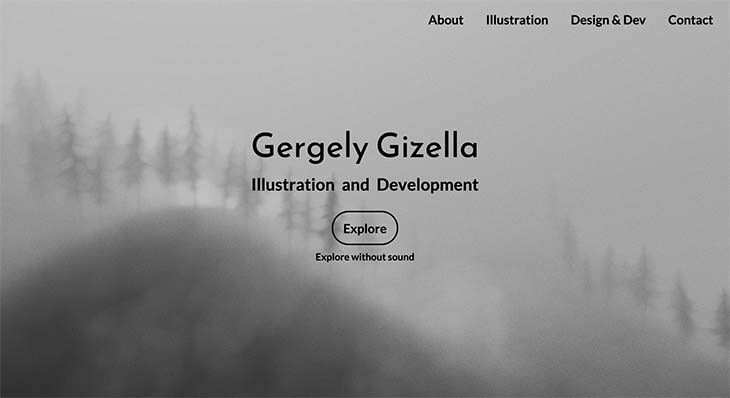
Logartis slides into the number two spot. This was a more personal web design showcasing a developer and illustrator whose website takes us on an interactive exploration of the work. Immediately we get to understand the journey we are to take, the animation invites us in, telling us a direct story and leads us to the work to be viewed. This animation had purpose, vision and impact. The effect when viewing from a mobile phone and laptop is very much the same, done well when viewing from either device.
3. The Ocean Agency
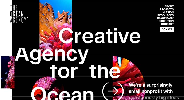
The Ocean Agency, coming in third, is a chic website that has a very powerful message, addressing the urgency of taking action looking after our oceans. This black and white theme, sprinkled with colored images and small motions speaks volumes. Not only are the issues discussed black and white, but the motion of taking gradual action and adding that splash of color really inspires the idea that they are thinking outside the box on this topic. This design speaks boldly to the prospective of the body of work engaging and inspiring, gently leading the viewer to take action by donating at the very beginning and again at the very end. This website worked well on both devices.
4. MA True Cannabis
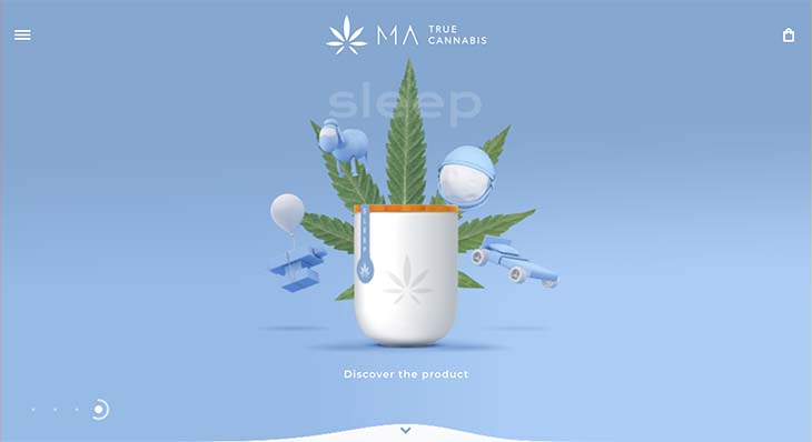
Matrue Cannabis, ranked forth, is a site that makes different cannabis products catering to different needs and uses. This was a really hard one to judge. I loved this site on both mobile and laptop—it had virtually the same effect. When first viewing the site it feels a bit of a riddle to understand what the animation is pointing to—until I further explored and understood the meaning behind the different themes. It was a site I could have put first but due to the confusion of my first impression, it didn’t quite make it there. Animation should really help with a clear message and although it tells a story, it is not an immediately understood.
5. LovveLavva
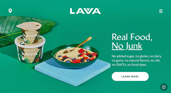
LovveLavva, taking the middle spot at number five, is a minimalist animation web design that, although having very little animation, used it in a way where the product and purpose of promoting and selling the product has been supported by the animation. The big gently moving leaves in the background move only the first time of viewing, and once seen to move, they then stay in place. This website was one I found to be very enjoyable. They understood less is more, and their focus was not lost at any point when viewing.
6. Eat Genesis
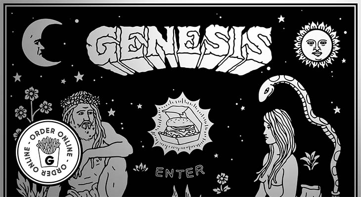
Eat Genesis is a plant-based restaurant with a merchandise shop. This was a tricky one to rank. It could have taken fourth place but I decided on sixth, due to the fact that they had a lot of animation (well done—it really spoke to their theme, and I would assume target audience) yet skimped out on providing a viewable food-menu (you have to click to download the menu PDF). Needless clicking creates frustration.
7. Kikk
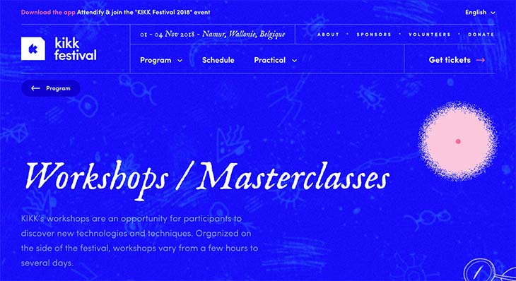
Kikk – a festival programs website.They have really given an out-of-this-world trippy experience with the floating animation on the website. When viewed by mobile, a lot of the movement is made into a static image. This site is ranked number seven due to the fact that, although the animation is done very well, there is slightly too much movement further down the page when viewing by laptop, which doesn’t seem to have purpose, and the animation which did really have a profound effect at the top of the page is then not as impactful when viewed on a mobile phone (as it is static).
8. Crazy About Eggs
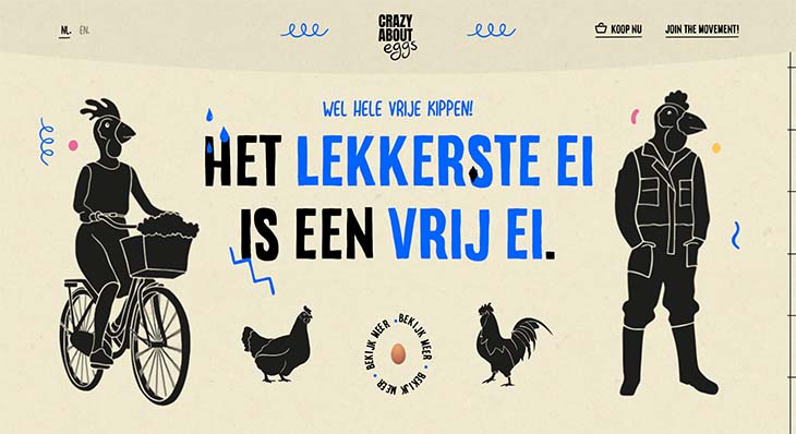
Crazy About Eggs is in spot number eight. When viewed on a mobile this is one of my favourite sites—the animation feels structured and gentle. When viewing this site by laptop it had just that little bit too much going on. After the site loads with its adorable chicken icon, immediately there are three moving animations across the page, my brain doesn’t know where to look or what the focus is. A big banner moves across after that, there is an overload of animation and movement as we scroll down, too much is unnecessary and takes away from the purpose of the page. Overall it is a beautifully done website; one of the few that work much better when viewing from a mobile.
9. Contra
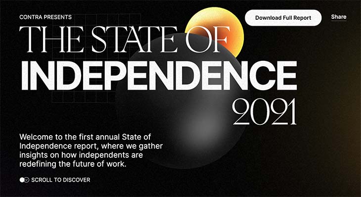
Contra is a website providing an annual state of independence report. This site takes position nine. On the website when viewed from a laptop the animation is well done, but well overdone, it feels so overwhelming at some points when viewed it jumps around, when in the middle of loading all the large animation pieces. As a viewer I did not feel in-control, I had to scroll down and then it would jump up the page as the animation came to focus. When viewing by a mobile the animation still was a bit funky, but the experience from a mobile was much more enjoyable. The animations that felt overboard on a laptop felt thought out on the mobile view and it was much easier to control the viewing of the page from mobile phone.
10. Wisr
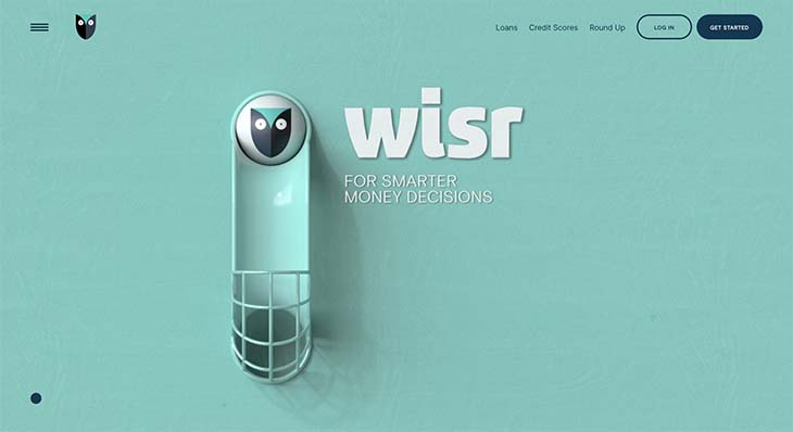
Wisr – takes tenth place, lucky last. Wisr is a financial guidance site that helps people with loans. Wisr was another site that could very easily have made first place; it was one of my favourite websites when viewed on a laptop, the animation was smart and fun to watch and engage with. The downfall came when I viewed this site by mobile phone. On the mobile phone the animation turned into a video that you had to click on to watch and opened multiple browser windows to view; which you then have to close individually creating frustration. Once the pop up windows had left I tried to rewatch the animation and it was near impossible to reload once I was ready to view the video. Almost all of the benefits from having the animation were lost when looking at this site from mobile phone.
Overall I came to the conclusion that although animation can be fun and interactive, too many of the designs I looked at that use animation were over-complicated and added a bit too much—often detracting from the message or direction I was intended to take. Animated movement for no apparent reason is a distraction.
What to be careful of when creating these web designs would have to be making sure to steer clear of overdoing an animated experience and having animation without clear purpose. Everything on a website should have a purpose to drive interaction, encouraging action for further engagement.