A law firm’s website shapes a potential client’s first impression. A well-designed website can effectively communicate a firm’s brand, expertise, and commitment to client service. It should strike a balance between aesthetics and functionality, guiding users to what they are looking for and ultimately inspiring confidence in the firm’s abilities. And it should gain the user’s trust and confidence within the first half-second of the site being opened.
All that, and it should have great search engine optimization and easy navigation also.
Here are ten law firm websites that have been really well-designed. They’re very different from one another (and definitely different from the generic law firm websites you see so many of), but different is what you should be aiming for, if you want to stand out.
- Michael McKneely
https://www.fresnocriminalattorney.com/
This website has very clear messaging. Every section down the homepage has attractive but subtle design differentiation—clarifying and supporting the work of the attorney a little more as you scroll down. You really feel you know what this lawyer offers by the time you’ve reached the bottom of the page. And it’s attractive without trying to over-wow you. Inner pages follow the same design patterns as the homepage, making the exercise of finding information easy and pleasurable.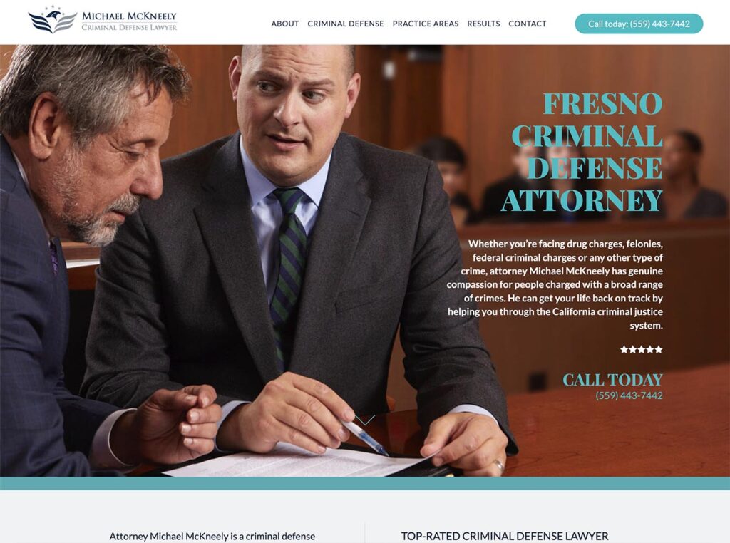
- Prosper Shaked
https://prosperlaw.com/
Prosper Shaked’s website opens with a cover image of the lawyer in a law office and a very clear branding message. The messaging in the homepage sections is also clear and helpful and you’d know, without having clicked further into the site, if this firm is likely to be a good fit.
- Kasowitz Benson Torres
https://www.kasowitz.com/
Everything about this website—the bold black and white design and orange highlights, the photos of team members and the opening words—says “Aggressive”. You cannot miss the message that these lawyers will fight for you, fiercely. The section covering their capabilities is exceptionally good, listing their different areas of practice—each of which opens a page with a full page describing their depth of experience in that area (well-written texts here!) plus expandable case histories and press notes.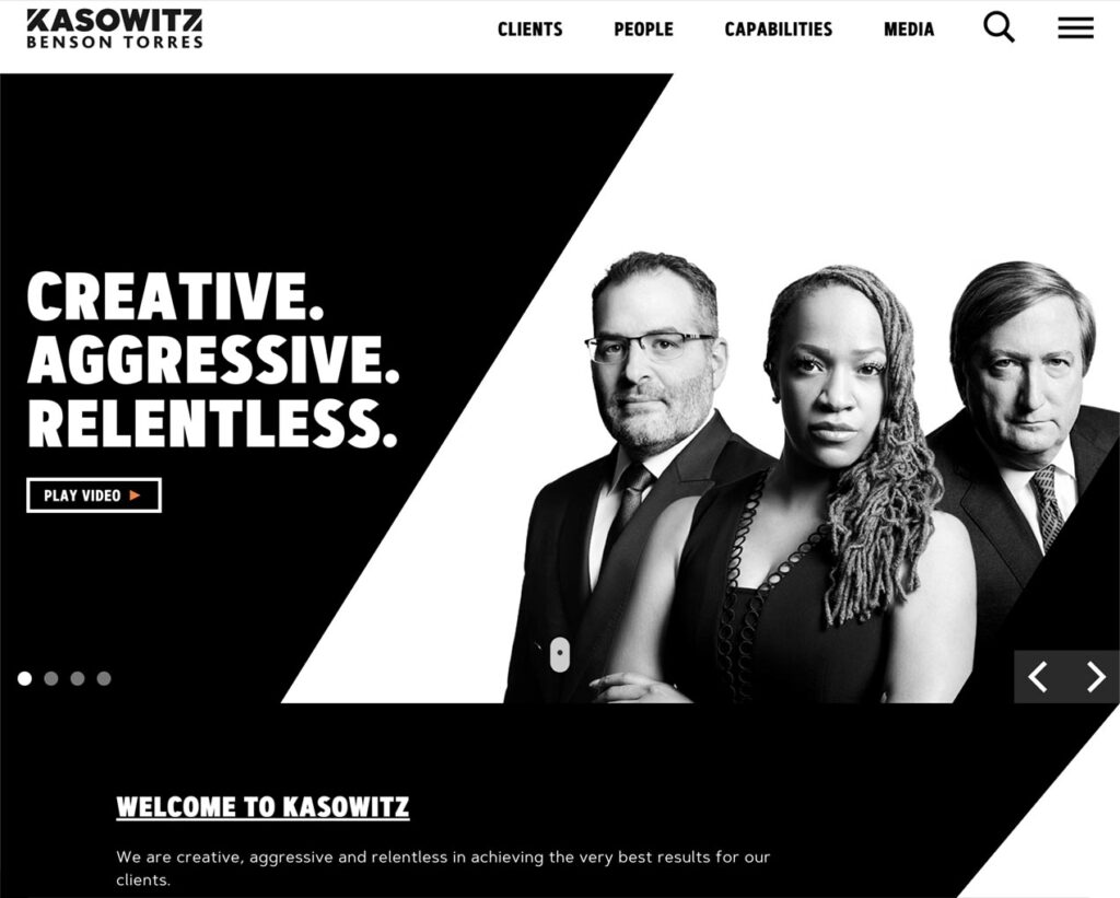
- Mintzer Mauch
https://www.mintzermauch.com/
With its strikingly minimalist design and clear branding as a women-owned environmental law firm, this website creates an immediately clear sense of what to expect from the firm. The simple navigation allows users to explore by practice area without being shown introductory texts on the homepage and, although it involves an extra click, this cuts down on the mental effort to find what you’re looking for. I also liked their news section that lists news posts without drama. Every page lets you quietly do one thing at a time without heavy-duty call-to-actions dominating your experience and although this goes counter to a lot of web design thinking, I found it refreshing. Who doesn’t know how to click the “contact” link?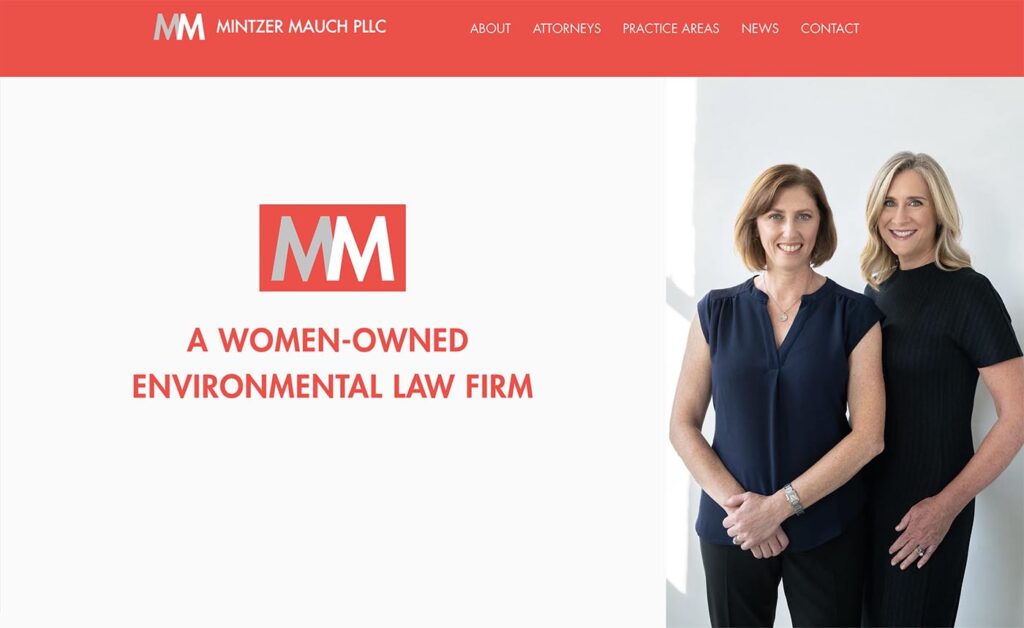 >
> - White & Case
https://www.whitecase.com/
What I really like about this website is the inner pages. Go to one of their areas-of-practice pages and the design is awesomely well thought-out. You get to see all their lawyers in each field, a general description of what they cover in each area, case studies, awards and news—all within a very sophisticated but simple-looking page.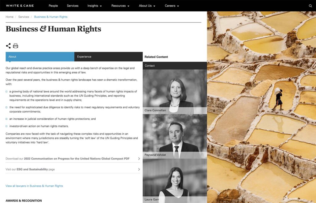
- Hanszen Laporte
https://www.hanszenlaporte.com/
This website stands out for its very clear messaging relating to purpose, principles and moral compass. It’s the first thing you learn when you open the website and the messaging is quietly reinforced all the way though the website. The fact that the first “practices” page displays the exact content you’ve already seen on the homepage is not a strength but the next-level pages for each area of practice are brief and clear. The quiet tones and brevity of texts help make this an appealing website generally.
- Carter/Ledyard
https://www.clm.com/en/
Carter Ledyard’s website makes a bold statement with its vibrant color scheme and clear opening statement on what kind of clients they work with. Its subtle but stylish design elements create both variety and familiarity as one navigates from page to page—making the experience pleasurable. Texts to read on interior pages are kept as minimal as possible, making it easy to focus on the content.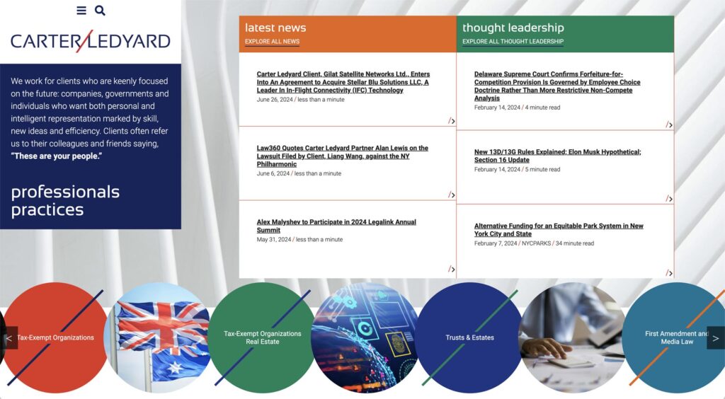
- Cameron & Kane
https://cameronandkane.com/
This website grabs attention with its striking opening two-slide full-screen slideshow—branding the law firm as both different and local in a way that piques interest. The bold typography and layout have a confident, modern aesthetic that sets it apart and they make it very clear in an opening statement, exactly what makes them different. The design is especially successful in the top half of the homepage—especially on mobile devices.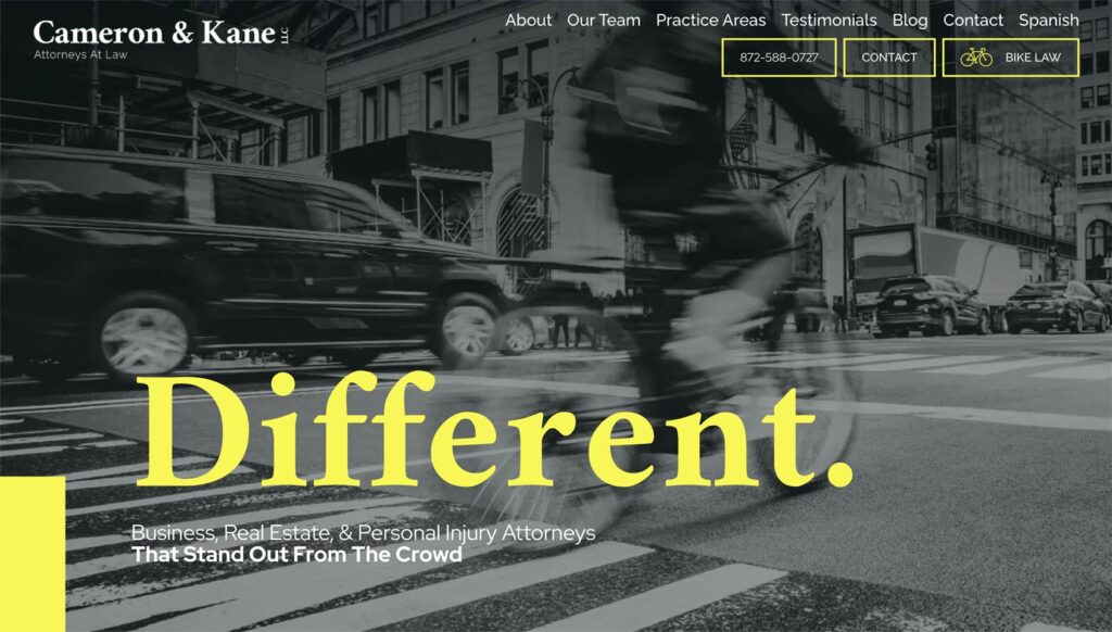
- Akin Gump
https://www.akingump.com/en
What I find interesting about this law firm website is that the visual design of the website is so delightful and noticeable I found myself looking through their website just to explore these visuals. One needs to be careful about over-doing the attention-getting qualities of the visuals (to ensure people are not distracted from actually finding the information they’re seeking) but I do think this website is worth looking at if you’re wanting to try something a bit bolder than the generic law firm website.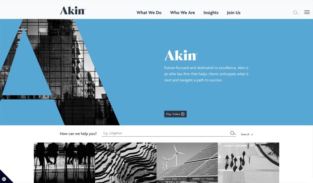
- Scharff Law Firm
https://scharfflawfirm.com/
I don’t always love blue and gold-themed websites but this law firm website uses a particularly pleasing blend of dark blue and gold and incorporates slanted sections that bring an element of “cool” to the otherwise corporate look. Inner pages all provide plenty of information that might be what people are looking for. On the whole, I think this is an excellent website for balancing the toughness and humanity that is needed for a law firm specializing in criminal law.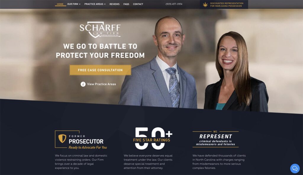
These are just a few examples of well-designed law firm websites that effectively balance aesthetics and functionality.
Are they they 100% brilliant? No design ever is, at least to a designer. More than one of the above websites fails to clarify exactly what they do on the homepage. One website’s homepage is dominated by their news posts. A couple of others use so many highlight colors or so many hover-animations that these elements risk becoming distractions more than guides.
But still, they have all made an impressive effort to use great website design to communicate well. Combine that with search engine optimization targeted to their ideal clients and I’d say you’re looking at some winning websites.
One other thing to remember: there are way too many law firm websites that open with a bland statement like “Whenever you need us, whatever the legal issue, and wherever you are, we are ready to respond with perspective, insight, and solutions.”
Don’t do that. It doesn’t matter how beautiful or interesting your website is visually—if you don’t use text as well as visuals to immediately clarify what distinguishes your work for the user, you might as well not hire a designer. If you’re like me, some of these websites tell you very clearly that this in NOT the law firm you would want to work with. That’s how it should be. A law firm website should make it very very clear who they want to work with (and what they can do for them).